
Columbus Crew - name: perfect. colors: perfect. logo: go a slight bit more traditional with the "dude" figures and you're there. overall: A
New York Red Bulls - name: I wish the team name was Red Bull New York. Other than that, I love this name. It is right, simply because it has a legitimate and logical reason to be (an owner sponsorship) and not a ridiculous and made up one (like MetroStars). colors: fine. logo: what can you do? Actually as a soccer crest it's better than most of the ones MLS outsources or assigns to its graphic design department. overall: B+
Toronto FC - name: perfect. colors: fine, boring in a good way, and a nice callout to Canadians everywhere (which, given Montreal and Vancouver's coming ascension, won't always be a unique facet of TFC's identity). logo: the second-best work MLS has ever done (see next team). overall: A
Chicago Fire - name: great. They have owned it from the beginning and the identity has only gotten stronger. colors: obvious and fine. logo: fantastic. I honestly can't believe they got this logo this right at the beginning of the league. It seems organic. overall: A
Kansas City Wizards - name: so-so. It's obviously been improved, and has founding equity. I still don't enjoy the Wizard of Oz connotation very much - seems way too flimsy to use as the basis for a team name (though: a switch to Oz FC would instantly make this one of my favorite names in world soccer). And there's the whole MO/KS thing... whatever. I wish the team was called either Oz FC (yeah!) or KC Blues. colors: good. logo: the new one is the definition of bland. It was switched in a few years ago just as the old rainbow was gaining some retro appeal. Either way, it's not the main trouble here, and could be much, much worse. overall: B-
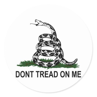
Philadelphia Union - name: pretty good. Feels a little stapled on, and slightly close to DC's for my taste, but solid and prepped to be timeless after a few years and some success. colors: good. I wish the color scheme was more UCLA blue and gold, but that's picking nits. logo: a very good attempt; one thing - the snake is just a bit too slick. Of all clubs, this one should play off of colonial, hand-made appeal. Lose the vector slickness in favor of something apologetically hand-crafted like the Gadsden snake completely and it's all good. overall: A-
New England Revolution - name: it's a grower. Revolution FC or SC would be better, in my humble opinion, but Revs is ingrained and it works. If they move to Boston one improbable day, Revolution of Boston FC would really make me happy (but maybe not many others). colors: way bland. This team should be playing off some both revolutionary war and local Boston sports themes. A Fenway green jersey (write a check, make it happen) with some white and navy would be awesome. Simple cream and navy blue. Or a rich yellow Don't Tread-inspired shirt with washed-out brown shorts and socks (similar to the Bruins new retro colors). Take a freaking chance (and get a sponsor, for god's sake). logo: a disaster that only gets more embarrassing as the years pass. It's so badly done that it doesn't even have the chance to be retro cool one day. Get a seal, a shield, anything. And - god, to dream - think about using the Bunker Hill pine tree flag and branding the imagery of the team around that potent and unique symbol. overall: C-
DC United - name: perfect. colors: perfect. logo: was at the top of a weak field years ago; starting to fall behind just a touch. There is much more right than wrong. The Romanian look of the eagle has always confused me. Maybe a talon clutching some arrows would kinda work better with the same vibe? What do I know. This team does things very well from a branding perspective. overall: A-
Los Angeles Galaxy - name: unchangeable post-Beckham. And that's fine. It works. colors: again, fine; they did of course copy one of the best. The sash could always come back as a third shirt - that wouldn't kill anybody, right? logo: bland but meant to exist over the heart instead of on some crappy souvenir as was the first version. And that is good. overall: B
Real Salt Lake - name: cringe-worthy. Royal Salt Lake would make this so very much more palatable (if still weird). A name that connected to the area would be even better (Salt Lake Saints? Lake FC?). colors - love them. logo - busy, and in a very un-MLS-like move, contains some strange quirkiness (like the lower-case "e") that actually helps it have a real personality. It just can't mask the lousiness of the name. overall: B-
FC Dallas - name: great. colors: fantastic. logo: really good. overall: A
Seattle Sounders FC - name: fantastic. colors: fantastic. logo: needs to be simplified by a factor of half. It's a logo that doesn't represent a real thing (like a seal or a shield does); it's just a collection of shapes straight from Adobe Illustrator. The Space Needle is a great symbol, however. Just a slight re-factoring to make the shield look like a real object would work wonders here. overall: A-
Colorado Rapids - name: good, but a case could be made that so much potential was left at the doorstep. Mile High FC, anyone? To these ears, that's unbeatable. colors: I need to be specific here; love the color combo, don't like that Colorado is the team using it. They should be playing off the navy/orange Bronco/Nugget heritage (while adding a twist trim color, like yellow or crimson). Ideally Philly would get the claret and blue combo a la the old Phillies unis but they have good reason to be in blue and yellow. Anyway, digression. Colorado has some classy uniforms. logo: it's fine, mostly good even. overall: B+
San Jose Earthquakes - name: poor. Earthquakes, plural? I guess I don't get it. I actually slightly preferred Clash, which was also pretty bad but at least interesting. I get the NASL connection, but as it was in Seattle and Vancouver, perhaps that history could have been honored in a cooler way. Also, the second there's a serious quake in California, this name is going to sound pretty unappealing. I would vote for a complete identity re-brand: Bay Soccer Club of San Jose. colors: very good. logo: another poor, unfocused work here; far too busy, and what is it? A smelly ball? If they remain Earthquakes, just simplify the logo (an iconic skyline seems to work in the Bay Area) to instantly improve the team's image. overall: C+
Houston Dynamo - name: pretty good; I liked the Locomotive suggestion but Dynamo works and already seems like it's a permanent fit. colors: really good. logo: somewhat abstract, but it's not hurting anybody. overall: A-
Chivas USA - name: a real problem. It reminds me of both failure and hokiness every time I read it. C.D.L.A. would have been better than fine and miles better than what happened (namely, the creation of the Clippers of soccer). On the plus side, it's easily fixable - either by re-branding a team virtually no one is attached to, or moving the team somewhere and starting over (for the record, I hope it's option A). colors: good and obviously not changing while the Chivas connection is live. logo: great in the sense that it's independently a classic work of design; not so great in that for C-USA it's a straight-up copy. A new version with some independent thought would be appreciated. In so many ways, this team has the most confusing identity in MLS when it should have one of the simplest, most unique, and most focused. overall: D+
Thanks for reading - and Revs front office, I can't build a stadium for ya, but I'm available locally to help transform your identity with some unique thinking. Kraft, give me a shout when you want to step up.
Bonus Material - how the current league table (and accompanying color swatches) would look if I had some type of omnipotence:
■■■ LA Galaxy
■■■ Columbus Crew
■■■ Royal Salt Lake
■■■ FC Dallas
■■■ Red Bull New York
■■■ Seattle Sounders FC
■■■ Mile High FC
■■■ Bay Soccer Club SJ
■■■ Toronto FC
■■■ Chicago Fire
■■■ Houston Dynamo
■■■ KC Blues
■■■ CDLA
■■■ Philadelphia Union
■■■ Revolution of Boston SC
■■■ DC United
■■■ Columbus Crew
■■■ Royal Salt Lake
■■■ FC Dallas
■■■ Red Bull New York
■■■ Seattle Sounders FC
■■■ Mile High FC
■■■ Bay Soccer Club SJ
■■■ Toronto FC
■■■ Chicago Fire
■■■ Houston Dynamo
■■■ KC Blues
■■■ CDLA
■■■ Philadelphia Union
■■■ Revolution of Boston SC
■■■ DC United